MOON WATCH
PAPER PROTOTYPE Project
One Week, Individual, Winter 2015
ASSIGNMENT
Assignment One of the MHCI+D Prototyping Studio course involved the design of a smart watch and accompanying mobile application.
We were allowed total creative control of both functionality and purpose of the design, so long as we created a paper prototype for usability testing and to showcase our ideas.
CONCEPT
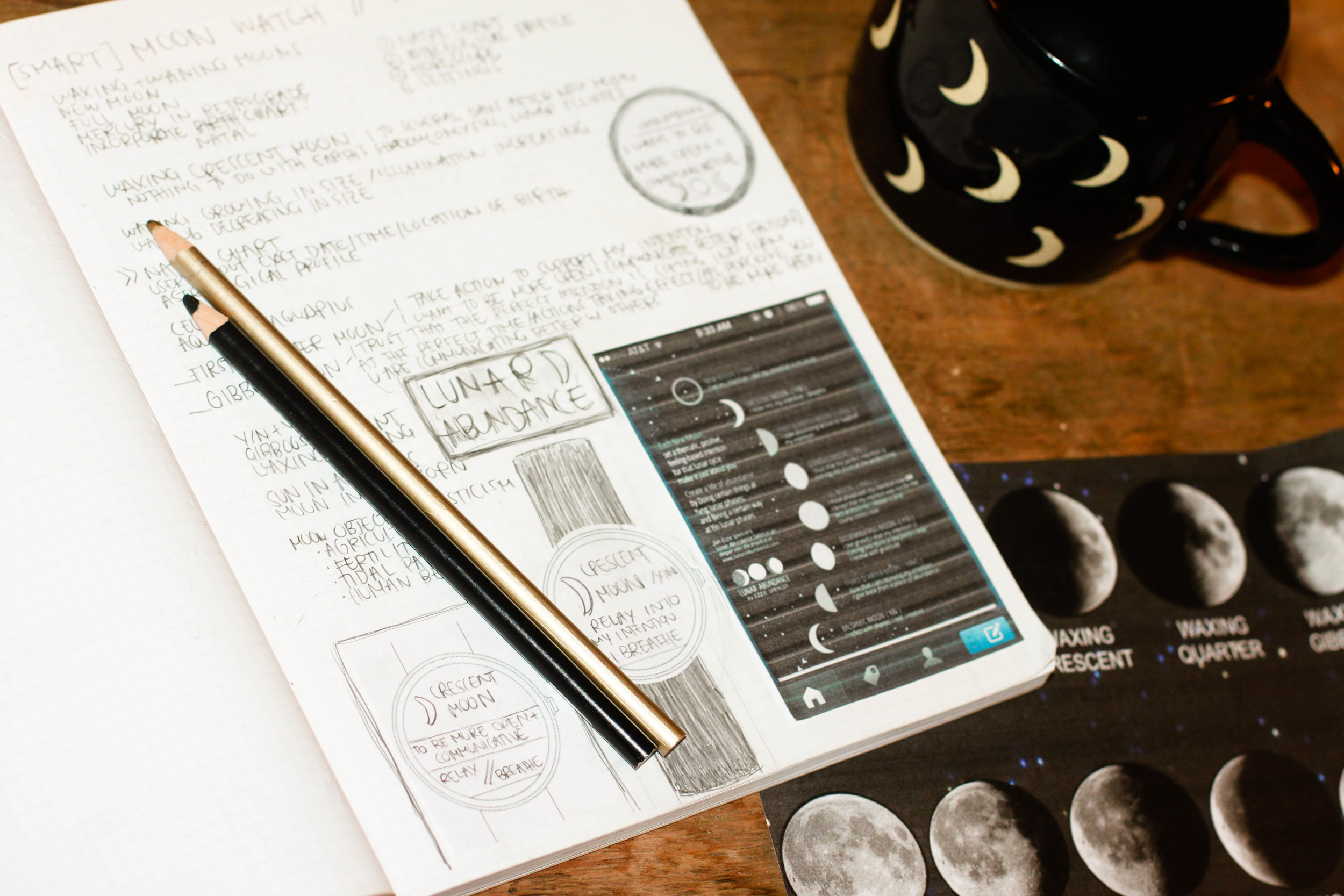
I'm not a big fan of smart watches in general, and have a love/hate relationship with tech that often leaves me yearning for real, paper books, letters sent by post, and the scent of a newspaper crossword.
Thus, after brainstorming several ideas and design opportunities, I decided to use new technologies to design an updated version of the long-appreciated moon watch.
Based on the moon phases of each lunar cycle, watches have long been able to track the moon. Utilizing this energy to realize dreams, goals and intentions, is an old practice that I incorporated into my design:
A smart watch application that notifies users of the current lunar phase, and reminds users of the goal or intention they set at the new moon.
APP INTEGRATION
By utilizing the mobile companion app to learn user birth time and location, a unique natal chart is created for, and accessible by, the user.
The chart provides users with insight into their personality and potential, as well as a complete astrological profile and regular horoscopes, creating a highly personalized user experience.
USABILITY TESTING
I tested my prototype with roommate Bryan Murphy, a graphic designer with a fascination of Native American culture and a love of Eastern medicine.
I learned that my first iteration was too complex and cluttered—I was trying to fit far too many features and too much information on a small, limited amount of real estate.
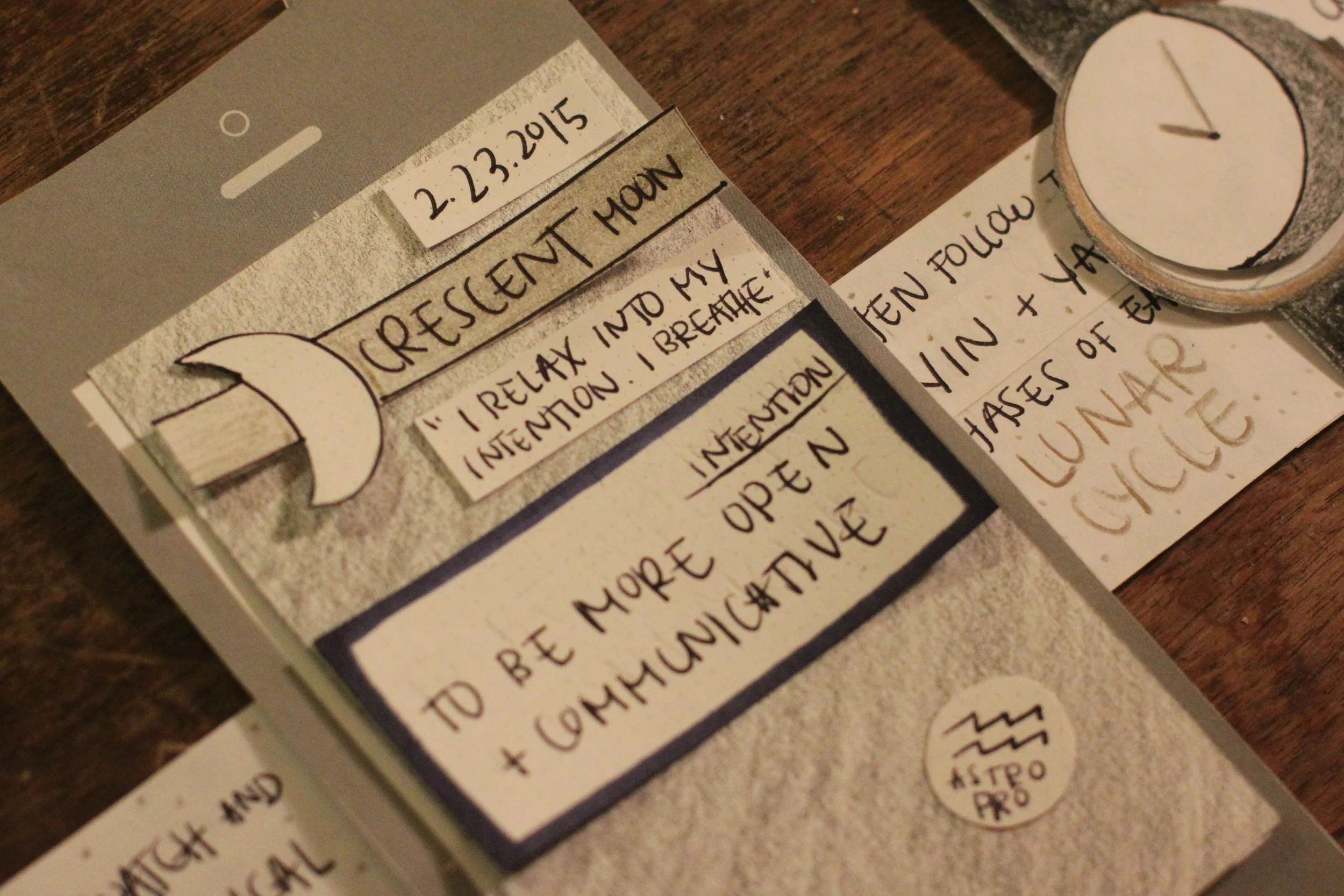
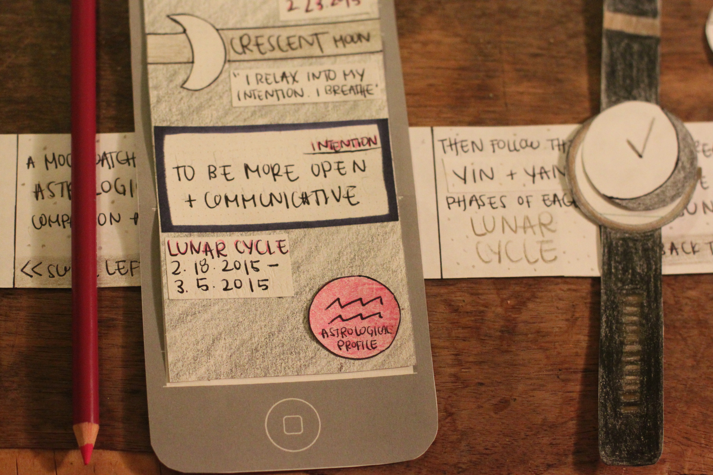
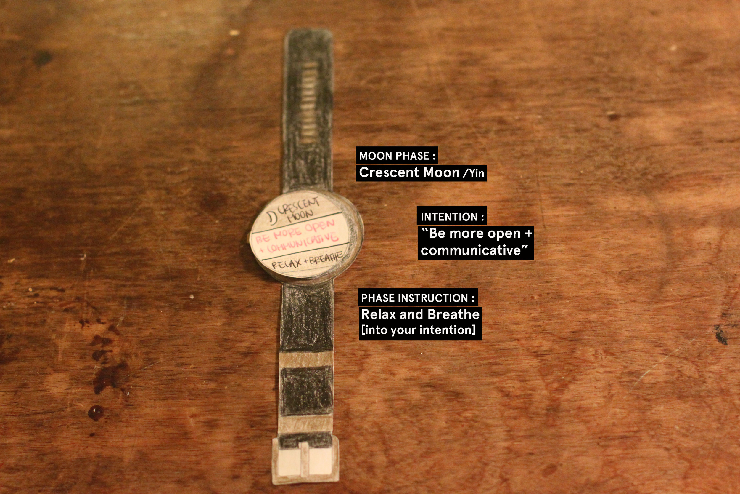
Through testing I learned what users want accessible by watch: time, current moon phase, instructions about what to do or how to be during the current yin or yang phase, and a reminder of the intention they set, or goal they are trying to realize. Additional information previously included on the watch, such as a daily horoscope, natal chart, etc., would be better left to the mobile companion app.
By simplifying the watch design, adjustments had to be made to the mobile companion app as well. For example, I added an astrological profile button to the home screen, allowing users access to their astrological sign, natal chart, horoscopes, etc., all based on the combination of their exact time and place of birth, combined with the current lunar phase.
Additionally, although this step was not tested, the mobile application provides easy entry of information such as time and place of birth, and intention or goal set at each new moon.
I also learned through usability testing that the app was not easily understood without explanation, so I created an introductory walk-through to explain the application’s purpose and functionality.
FEEDBACK
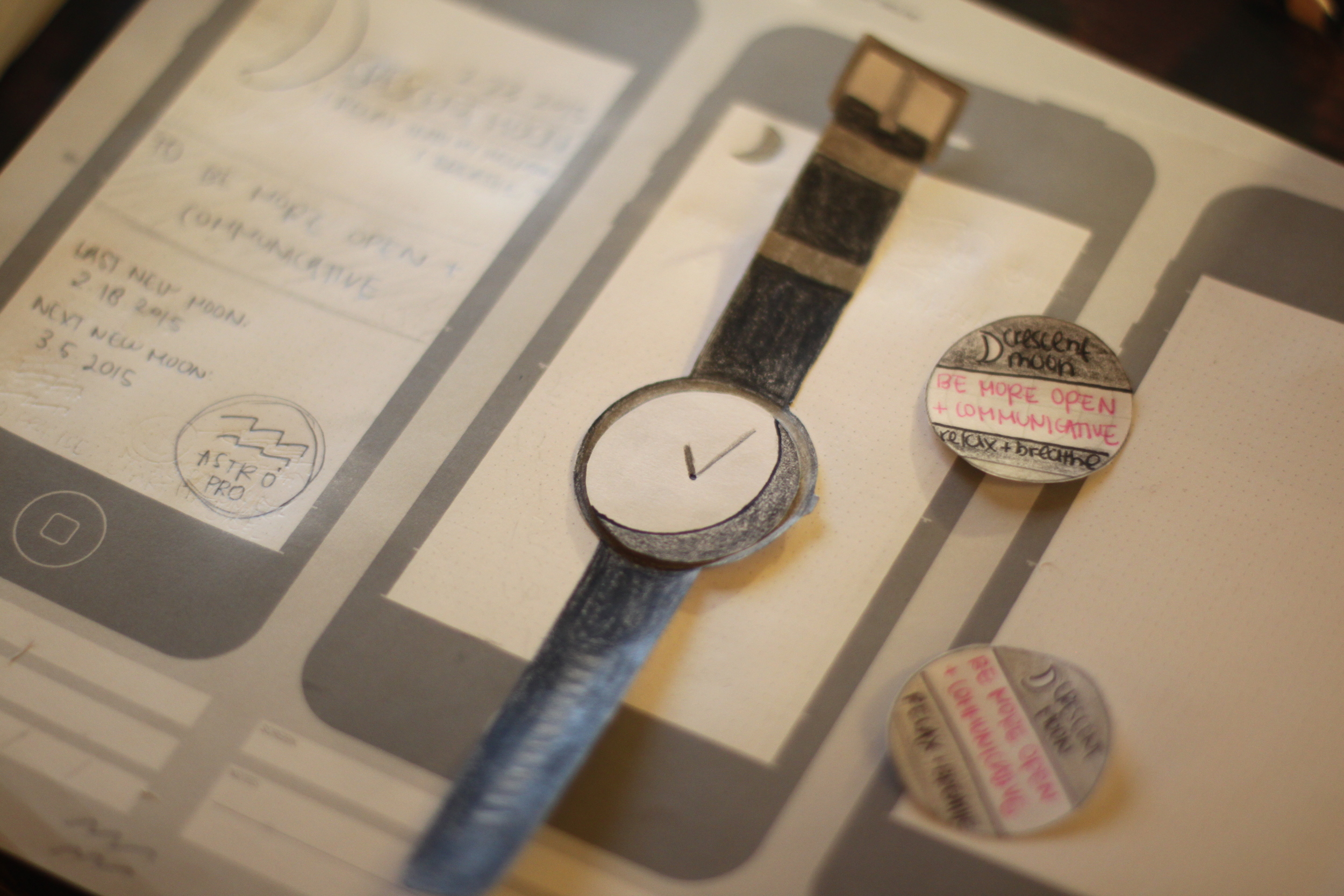
The final design was well received by Bryan, my usability tester, after showing him the changes I had made. He appreciated the clean design of a simple watch face with limited features, leaving the wordiness and complicated functions to the mobile application.
One element that was not clear, however, was the way the watch face / moon phase functioned. The idea is that the face itself acts as a moon—as the lunar cycle occurs, the watch face seemingly grows in much the same way as the real moon. In other words, at the new moon start of each lunar cycle, the watch face appears empty, and by the arrival of the full moon the face appears full (with crescent, first quarter, and gibbous stages in between, and disseminating, third quarter, and balsamic stages after).
Although I believe this design would be clean, clear, and intuitive to understand in it’s real form, it was confusing as a static paper prototype that represented only a single moment of the lunar cycle—perhaps creating several prototypes representing multiple days within a cycle would make the concept more clear.
Besides the above described downfall, my design was a success, and the process an excellent learning opportunity.
LEARNINGS
My biggest take away from this project was the value of research and usability testing. With more time, I would have talked to users before even beginning the project, tested my design with more users throughout the process, and perhaps even created alternate designs for A/B testing.
In the future, I plan to get my ideas and designs in front of users early and often.